> ## Documentation Index
> Fetch the complete documentation index at: https://docs.velure.dev/llms.txt
> Use this file to discover all available pages before exploring further.
# Icons
> Icon Component System Documentation
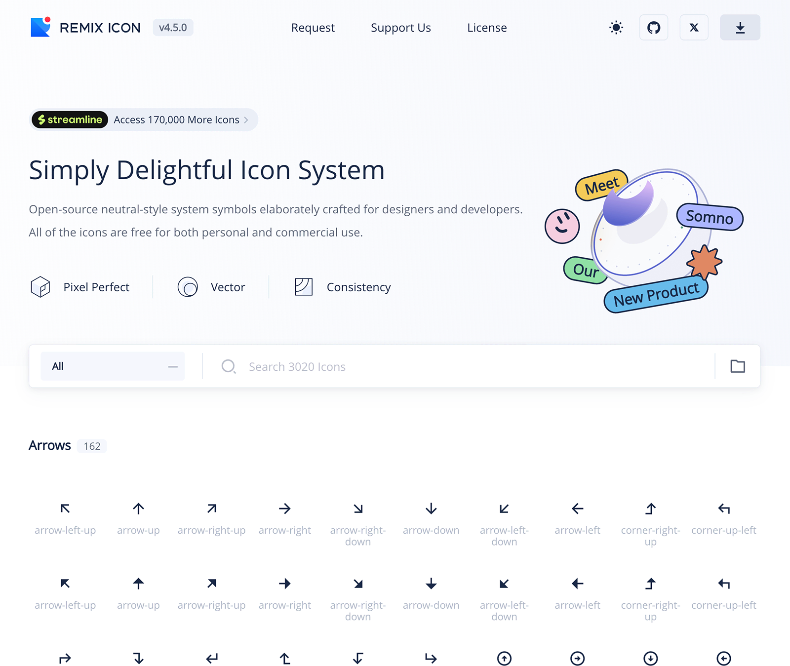
The icon component system renders icons from the [RemixIcon library](https://remixicon.com/). It supports optional customization, such as filling the icon for a solid appearance.
RemixIcon is licensed based on the Apache License and all rights of products are reserved for RemixIcon.
***
## Features
Choose from over 1000 icons in the RemixIcon library for any design need.
Supports filled (solid) styles and flexible size and color customization.
Matches RemixIcon naming conventions for intuitive use and recognition.
Easily combine icons with components like buttons to enhance functionality.
***
## Icons List
The full list of available icons can be found on the [RemixIcon website](https://remixicon.com/). The `IconDownload` component is one example from this collection, but you can use other icons by importing and rendering them in a similar way.
Each icon is name the same as the Remix version but without `-line` or `-fill` at the end. For example, `arrow-up-line` and `arrow-up-fill` will share the component name of ``.
***
# Importing Icons from Node Modules
Import icons from `"@robojuice/velure-ui/src/icons"`.
## Example
```vue theme={null}
```
### Basic Usage
To use the `IconUpload` component, simply include it in your Vue component:
```vue theme={null}
```
### Filled Icon
To render the icon in a filled (solid) style:
```vue theme={null}
```
***
## Props
Applies a filled (solid) style to the icon.
***
### Integrating Icons in Buttons
You can use the icons with other components, such as buttons:
```vue theme={null}
```
***
## Notes
* Make sure the RemixIcon library is installed and properly configured in your project.
* To use custom icons, you may need to adjust styling (e.g., size, color) with CSS or inline styles.
* Refer to the [RemixIcon documentation](https://remixicon.com/) for additional options and examples.
 The icon component system renders icons from the [RemixIcon library](https://remixicon.com/). It supports optional customization, such as filling the icon for a solid appearance.